drafting for contents page
LAYOUT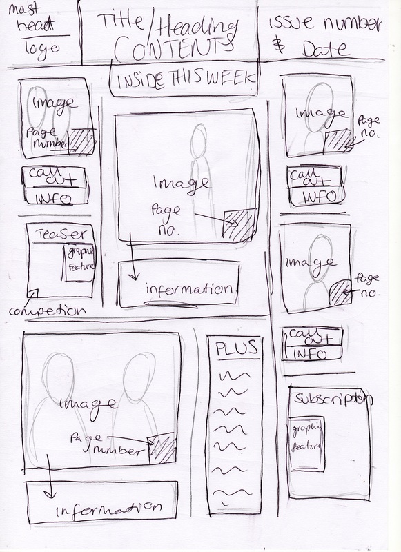
I love the layout of my contents page, its different from the standard list of words and numbers. I like the way i have a picture and then a little brief description below it, and below some of them are call outs (quote from the band/artist). I like the idea of call outs as they are used to pull the reader in, also it gets them to buy the magazine as they want to read that article. The page numbers are going to be big so that they stand out. I have decided to put the date and issue number on the contents page as it seems to be conventional, as i found in my research. I am going to make my own little subscription advert thing in the bottom corner (idea came from research). I'm also planning on adding the little competition thing on the contents page, with a picture of the prize (iPhone 4).
|
PhotographsThese are the photographs from many separate shoots i took for the contents page. I have done a shoot for each picture i needed so i could get varied expressions and positions.
COLOUR SCHEME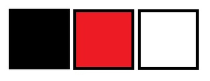
Above is the colour scheme for the contents page. I have made it exactly the same as the front cover so both pages look like they are from the same magazine. Also this is quite a conventional colour scheme for music magazines.
|
